No matter if you have a good product or not, sooner or later one has to step back and rethink what one is doing. I've spent the last couple of weeks working on the Hotspots frontend. We are actually rewriting it to use Backbone & Backbone.Marionette. If the last 2 names doesn't ring a bell with you, don't worry! That are JavaScript frameworks and you don't need to know anything about them in order to use the new Hotspots. Those frameworks help us bring structure to our JavaScript and this improves the final product. You'll be able to style a lot of elements of the UI that you weren't previously able to do without hacking the core. Also since the Joomla project is slowly phasing out Mootools as the JavaScript framework of choice, we are also doing that and moving to jQuery. With the JS frameworks out of our way let's get back to the UI.
Back in 2010 when the current UI was introduced it was accepted very positively. But as it is normal the case - feature requests pile up & one realises that the UI cannot support everything.
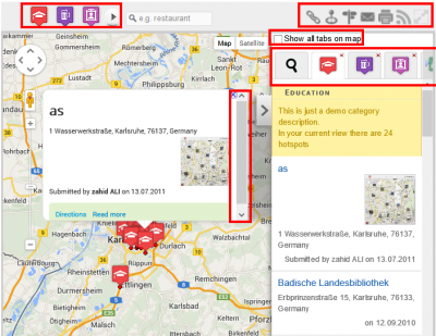
Here is a screenshot of the current Hotspots UI.
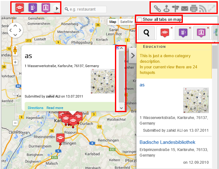
Marked in red are all the problematic areas of the current design.
The thing that was bugging me the most is the InfoWindow (yes, that bubbly thing when you click on a marker on the map). Starting with version 3.1.10 of the gmaps API this thing just refused to behave as it should. The text was overflowing and it was never resizing. This is when I had to find a different solution as it seemed that the google maps API team was either not interesting in fixing the InfoWindow or I was the only one experiencing that issue. That is why I picked the InfoBubble library. But it also doesn't live up to my expectations. What most of you don't realise is that the Bubble calculates its height and width automatically. It looks for the height and width of the map, it does some calculations and voila. The Problem with that is that unlike with the google maps website most of you don't use the whole available browser space to show the map... The map is most of the time in a container that is just 700px wide. So we have the menu on the right, we click on a marker and the Bubble opens -> it takes nearly all the available map space left. Not only is the navigation now hard, because you don't have a lot of space to pan the map, but since most of you have way too long description texts there is a vertical scrollbar in the bubble... That is when it struck me - why the heck do we need an infoWindow for? To show what information exactly? We just need to expand the description of the hotspot in the menu (show directions, zoom, streetview & make sure that the hotspot in the menu is clearly highlighted as the currently selected), change the icon on the map so that the user can realise which location he is currently looking at, but we don't need to show an infowindow on the map. Why hide all other hotspots on the map with an infoWindow and make navigation hard? That doesn't make sense! That is why I've decided to remove the InfoWindow in the upcoming Hotspots 4.0.
Another thing from the UI that was really bugging me, were the categories selection. People started to want nested categories and our current UI definitely didn't allow that. And some of you have like 30 categories... You have to either scroll like crazy left and right or you opt to show them all at once -> making that bar look like a Christmas tree. Initially I thought that instead of showing those icons, I could merge everything into a single button "categories". When you click on it you get a dropdown menu with all the categories. Now that is maybe a fine decision, but I'm constantly bombarded with posts that tell me that the map doesn't look good enough on mobile. Now imagine having a dropdown menu on a mobile device? I know, we can style it and kind of make it work, but it is still not good enough.And it also means that if you want to switch to a different category you always have to click 2 times instead of just 1.
Let's forget about the categories for a second and go to the next UI element - the tabs. There is nothing wrong with the tabs per se, but problems start when you have 10 categories and you decide to open all of them. Then the menu fills up with 10 tabs + 1 for the search & you have to endlessly scroll left and right till you find the category that you are interested in. After thinking about this for few days I finally came up with what I consider a better solution. Why split the hotspots in different tabs? Why not show them all in the same tab and depending on the user selection of the categories -> show just hotspots in category 1 or both 1 & 2. Each hotspot could have his category icon in front of the title so to the user it will be clear in which category the hotspot was. Now he will have to navigate just in 1 tab vertically, and not in 20 tabs both vertically and horizontally when he wants to move to another location. Alone this design change magically solved a lot of other code design issues that Hotspots was suffering from. In the past in order to get the hotspots for all the tabs we had to do 1 query per category. So if you wanted to show 20 categories at once on the map, in the background we were doing 20 SQL requests to fetch the data. Then we were doing some counts to calculate how many hotspots we have in the current view... It was not good. And now, by merging everything in the same tab -> we have 1 query for everything. Not only that but now I'm able to put the "search hotspots" filter where it belongs -> in the hotspots tab.
The search tab will change to a directions tab and there you could search for a location or get the directions from point A to B. For those of you who always wanted to use hotspots as a store locator this would basically mean -> Start the map centered on the directions tab (with all categories loaded per default). The user can then type his address, the map will focus on the location and he will be able to see the locations around.
So here is a wireframe with the changes.
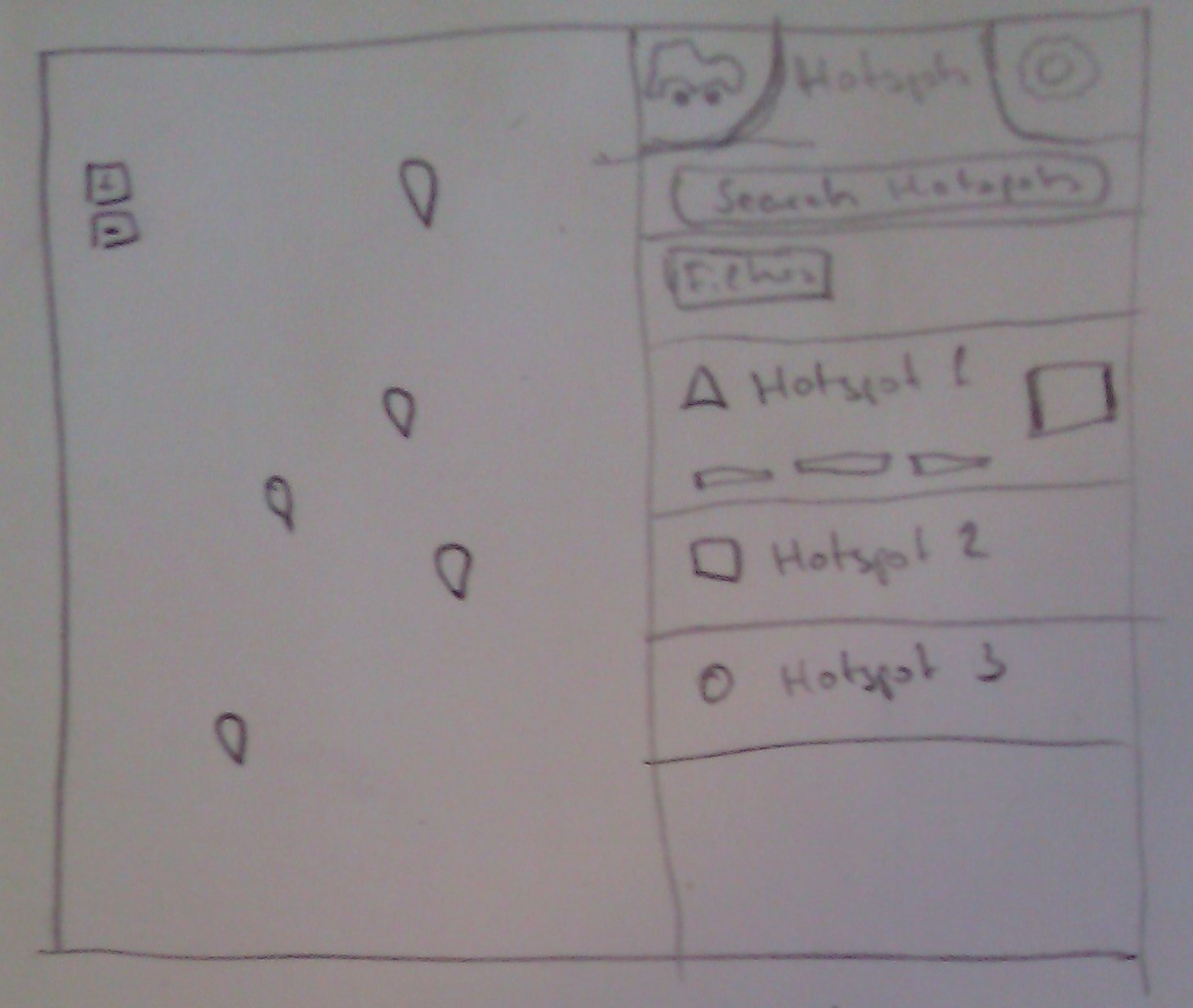
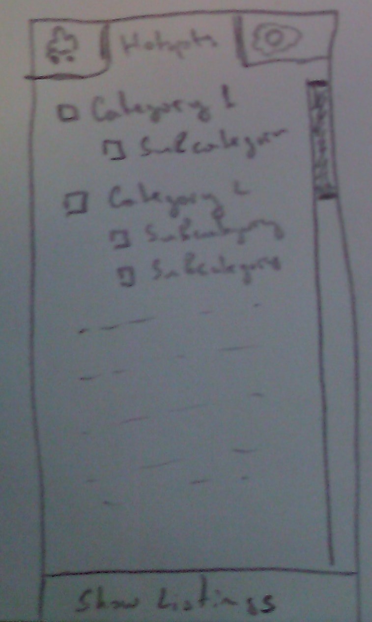
Basically the navigation bar on the top is not going to be there anymore. The information from it is now moved to the menu. Our menu will be simple. It will have 3 tabs - directions, hotspots and settings. The search for location input field is now moved under the hotspots tab. Under the filters tab we currently have the list with categories. The categories are listed in a tree like structure with a checkbox in front of them. The user can select all the categories he wants to see and has to click on show listing to apply his filter. This works good both on desktop and mobile. Under the settings tab the user will be able to turn on the weather layer, the traffic, bicycle layers etc. He will be able to create a map that he wants to use, not one that is forced to him by the admin of the site.
The thing that we are currently not 100% sure what to do with are the buttons on the right in the toolbar.
We no longer need a link button as hotspots 4 is able to produce links that are unique for each location.
The center map button will be changed with a "my location" button that we'll add directly to the map.
The directions button is no longer necessary as we have a dedicated directions tab.
Now the question is where to put the mail, print, rss and resize map buttons? The mail button will no longer open a modal window, as this one cannot resize depending on the screen. We plan to add the mail form directly in a new tab in the menu. The print view will also be rewritten and it will allow you to specify which parts of the application you want to print. Just the map, or map with hotspots etc.
RSS and resize the map will behave as in the current hotspots version.
Now the real question is - where do we put them :) If you have any ideas please share them with us in the comment section below!
