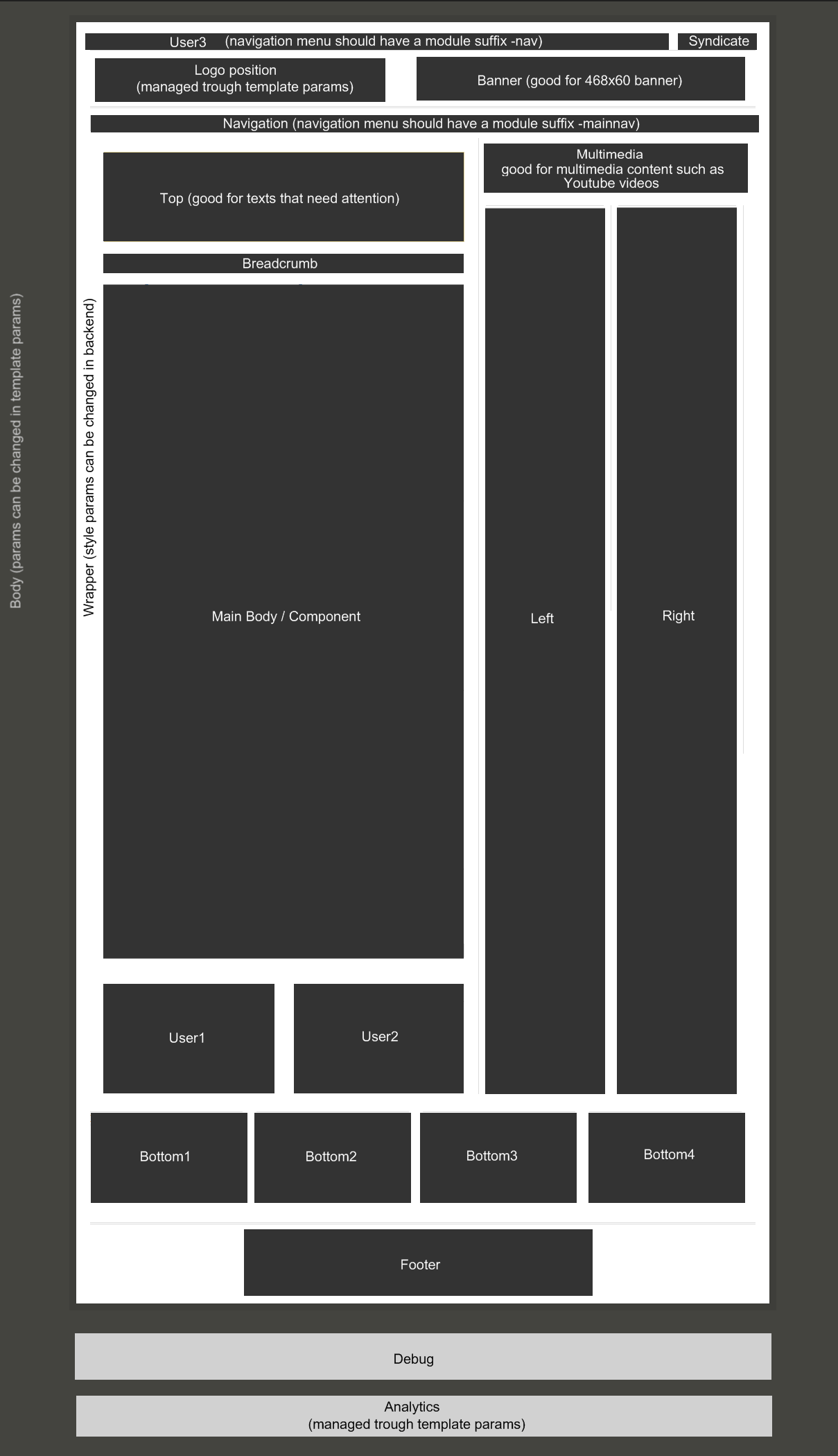
With this blog post I would like to explain you what module position are available within BiggieSmalls. Click on the picture to enlarge it. Under it you will find additional info about the different module positions.
- User3 - this position is good for a top menu. To use it for a horizontal menu you should open the module settings and under Advanced Parameters insert the following class suffix "-nav" (without the quotation mark)
- Syndicate - This module position is made specially for joomla's default syndicate module, but you can place anything in it. If you have something published in syndicate, then the user3 module position has 85% width and syndicate only 15%. If you don't use this position, then user3 has 100% width.
- Banner - ideal for standard banner (468x60) or horizontal login
- Navigation - this position sits just underneath the header. The main purpose is to have a main menu navigation there. If you want to have a horizontal menu, open the module settings and under Advanced Parameters insert the following class suffix "-mainnav" (withouth the quotation mark)
the navigation module position is also perfect for slideshow modules like the one on the home page of compojoom :) - Top - you can style the background, border and text color of this module - ideal for text that need attention from your users
- Breadcrumb - does this at all need explanation?
- User1 and User2 - those positions are stretching. This means if you publish a module in user1 and nothing in user2 - user 1 will take all the space.
- Multimedia - this module position is as wide as left + right module positions. It is perfect for multimedia content such as videos or flash mp3 player
- Left & Right + Component - if you don't use left & right, then the component will take all the space. If you use only left or right, then the component position will take the space of the empty template position.
- bottom1 & bottom2 & bottom3 & bottom4 - these positions are all stretching
- analytics - you have a field in template params where you can enter your analytics code.
Additional Information
Left + Right modules can be either on the left or on the right side.
This is a sample of the 'attention' style. Use this style to denote very important information to your users. To use this use the folllowing html: .... This is a sample of the 'notice' style. Use this style to denote very important information to your users. To use this use the folllowing html: .... This is a sample of the 'alert' style. Use this style to denote very important information to your users. To use this use the folllowing html: .... This is a sample of the 'download' style. Use this style to denote very important information to your users. To use this use the folllowing html: .... This is a sample of the 'approved' style. Use this style to denote very important information to your users. To use this use the folllowing html: .... This is a sample of the 'media' style. Use this style to denote very important information to your users. To use this use the folllowing html: ....
If you have any additional questions, don't hesitate to ask :)
Stay tuned BiggieSmalls is due to be released on the 9th of September 2009 at 9:09h .


