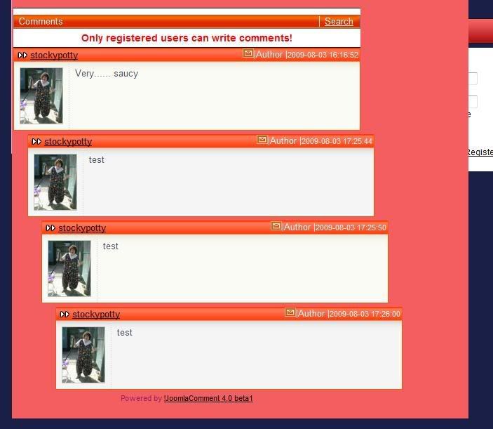
That 'Stairway' look is not a bug. You've got nested comments enabled, and each comment is a reply to the one before it rather than a reply to the original.
OK lets say, in your first screenie you've got four comments there. We'll call them Comment 1 to Comment 4.
Comment 2 is a reply to Comment 1, so it's indented.
Comment 3 is a reply to Comment 2, so it's further indented.
Comment 4 is a reply to Comment 3, so it's indented even more than Comment 3.
On that first website, try replying to Comment 2 again. The new Comment 5 should show directly underneath Comment 3 with the same indent, because it's the second reply to Comment 2.
This is by design - it is the 100% accurate and correct way to represent a "Nested Tree Layout", much like the Folder Pane in Windows Explorer. Alas, it can be a confusing layout to lookout, it's not very visually advanced/clean. The soon to come Premium templates will look much better at presenting in a nested display (similar style to YouTube) and will clearly indicate that a comment is a direct reply to another comment
 EDIT:
EDIT: That comment system looks really good... it's inspired me to make a JoomlaComment template similarly! Can you share where it's from? Looks like Wordpress.


